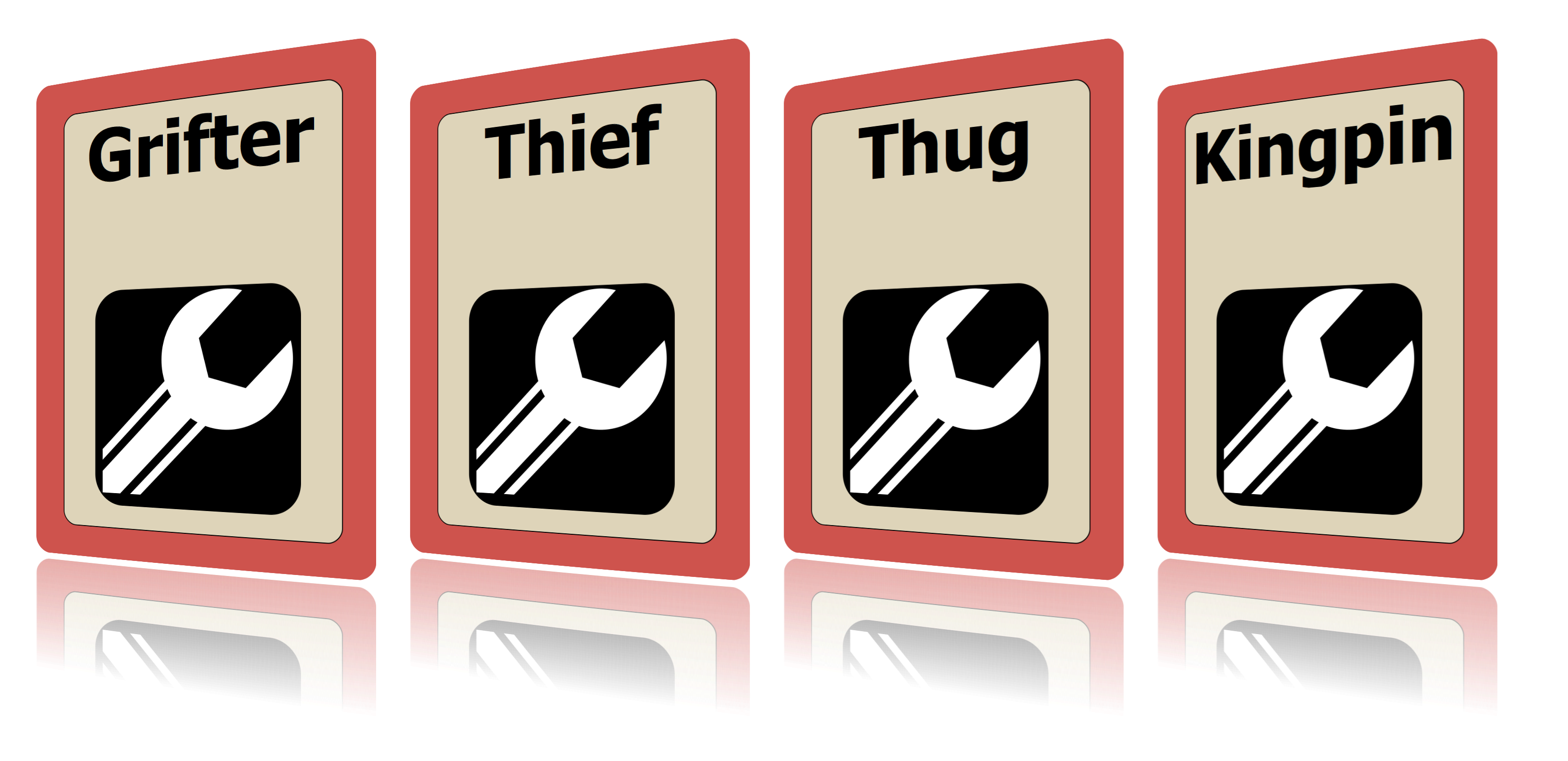
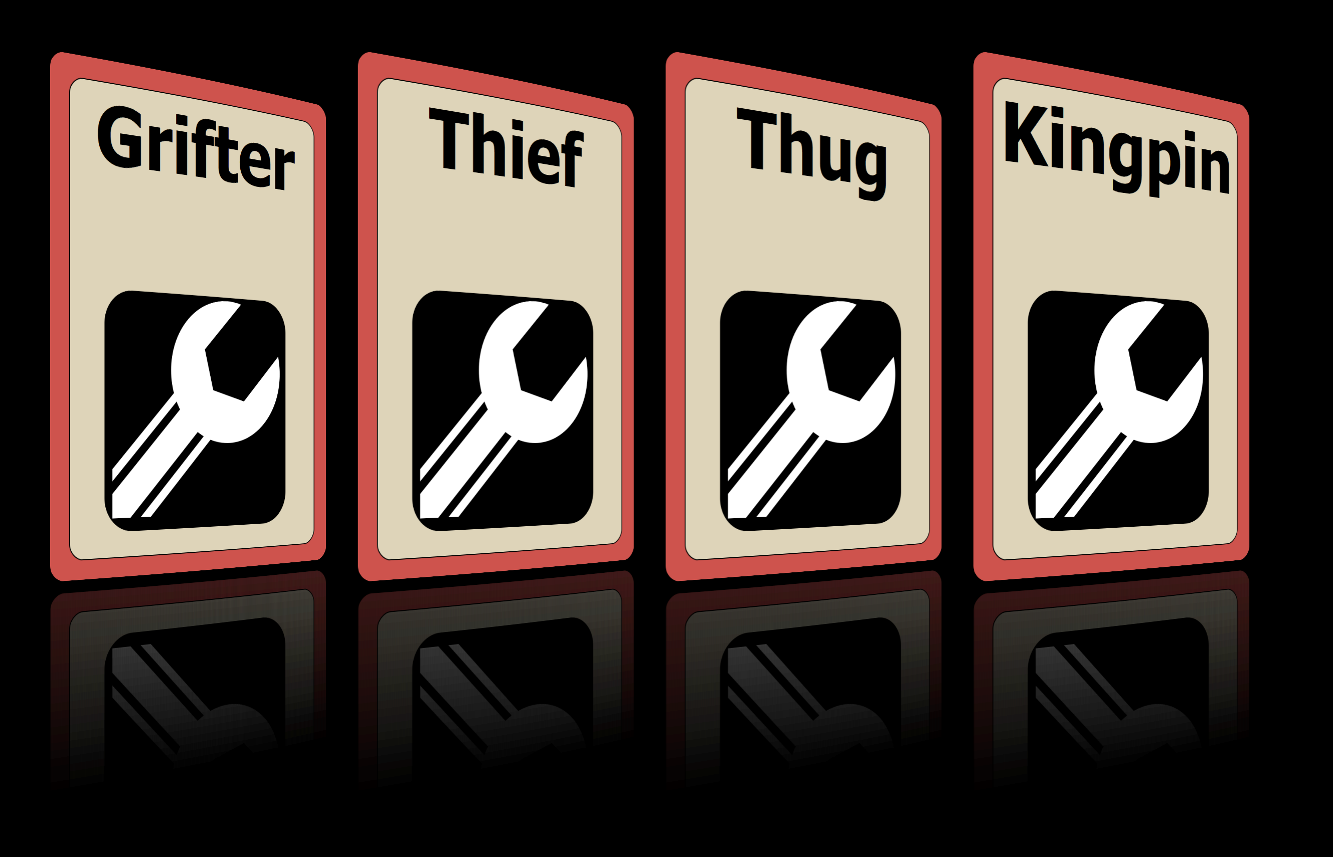
showcase
Renders a range of cards in a showcase as if they are sitting in 3D on a reflective surface.
Options
- trim
default:
0the margin around the card to trim before putting into the image
- trim_radius
default:
38the rounded rectangle radius around the card to trim before putting into the image. Defaults to 1/8in rounded corners (38px).
- scale
default:
0.8Percentage of original width of each (trimmed) card to scale to. Must be between 0.0 and 1.0, but starts looking bad around 0.6.
- offset
default:
1.1Percentage of the scaled width of each card to shift each offset. e.g. 1.1 is a 10% shift, and 0.95 is overlapping by 5%
- fill_color
default:
:whiteBackdrop color. Usually black or white. See Specifying Colors & Gradients.
- reflect_offset
default:
15The number of pixels between the bottom of the card and the reflection. See Unit Conversion
- reflect_strength
default:
0.2The starting alpha transparency of the reflection (at the top of the card). Percentage between 0 and 1. Looks more realistic at low values since even shiny surfaces lose a lot of light.
- reflect_percent
default:
0.25The length of the reflection in percentage of the card. Larger values tend to make the reflection draw just as much attention as the card, which is not good.
- face
default:
:leftwhich direction the cards face. Anything but
:rightwill face left- margin
default:
75the margin around the entire image. Supports Unit Conversion
- file
default:
'showcase.png'The file to save relative to the current directory. Will overwrite without warning.
- dir
default:
_outputThe directory for the output to be sent to. Will be created if it doesn’t exist. Relative to the current directory.
- range
default:
:allthe range of cards over which this will be rendered. See Using range to specify cards
Examples
This sample lives here.
1 2 3 4 5 6 7 8 9 10 11 12 13 14 15 16 17 18 19 20 21 22 23 24 25 | require 'squib'
# Showcases are a neat way to show off your cards in a modern way, using a
# reflection and a persepctive effect to make them look 3D
Squib::Deck.new(cards: 4) do
background color: '#CE534D'
rect fill_color: '#DED4B9', x: 78, y: 78,
width: '2.25in', height: '3.25in', radius: 32
text str: %w(Grifter Thief Thug Kingpin),
font: 'Helvetica,Sans weight=800 40',
x: 78, y: 78, width: '2.25in', align: :center
svg file: 'spanner.svg', x: (825 - 500) / 2, y: 500, width: 500, height: 500
# Defaults are pretty sensible.
showcase file: 'showcase.png'
# Here's a more complete example.
# Tons of ways to tweak it if you like - check the docs.
showcase trim: 32, trim_radius: 32, margin: 100, face: :right,
scale: 0.85, offset: 0.95, fill_color: :black,
reflect_offset: 25, reflect_strength: 0.1, reflect_percent: 0.4,
file: 'showcase2.png'
save_png prefix: 'showcase_individual_' # to show that they're not trimmed
end
|